Armstrong Flooring · Residential
Creating a clearer path to the right flooring.
Armstrong Residential had no collection pages, little product education, and navigation that had become a catch-all. I reorganized the site, designed the new pages, and led delivery in batches, starting with the homepage and navigation.
Build the homepage components first.
The old navigation mixed flooring types with links such as “Color & Look,” “Made in the USA,” and “What’s New.” The homepage also had limited space to feature collections and lead visitors further into the site.
Starting with the homepage gave us a hero and feature sections to reuse on later pages. It also created prominent placements for featured collections before the rest of the redesign was complete.
The redesigned homepage adds multiple hero features and a dedicated section for featured collections.
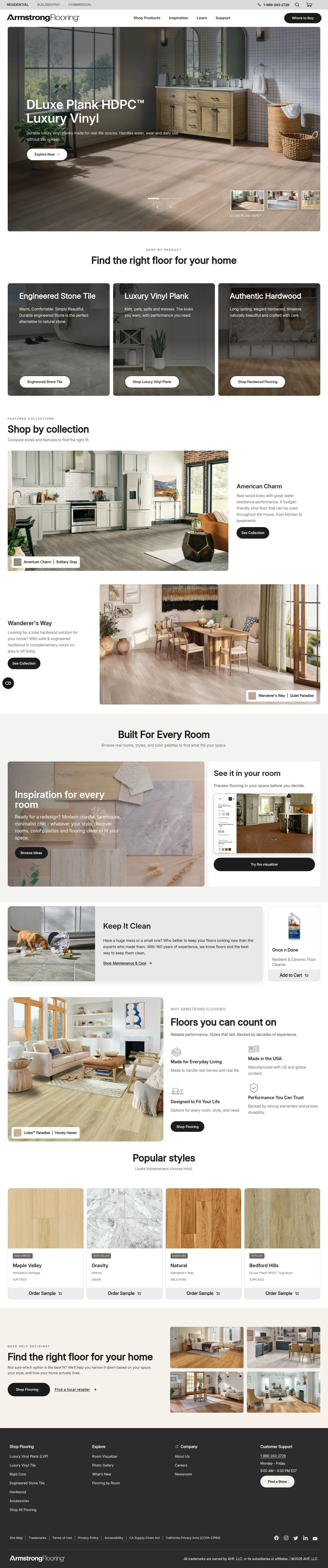
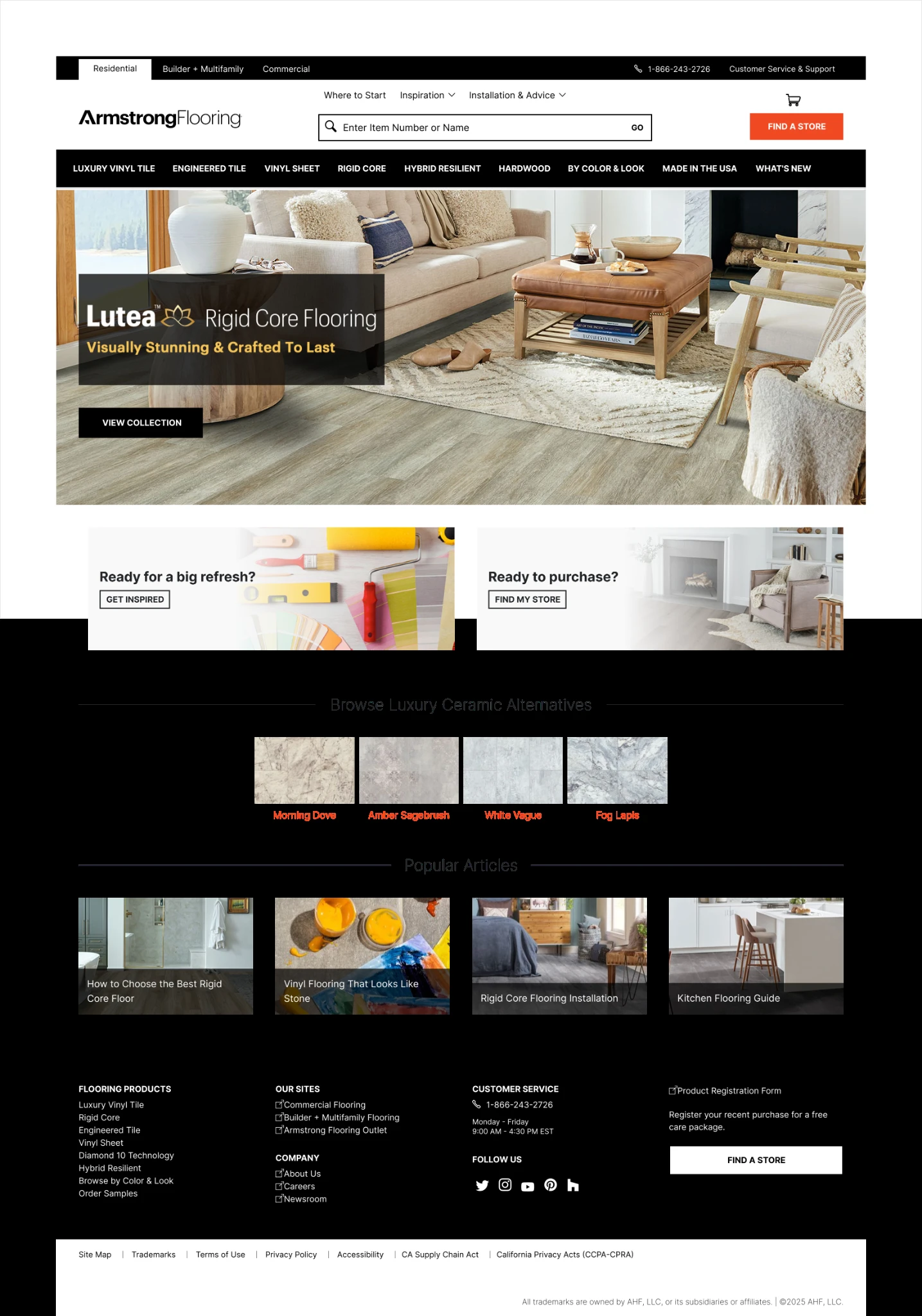
Drag the divider or use the arrow keys to compare. Captures share the same width and top alignment.
Introduce the missing collection pages.
The missing step was understanding the collection before choosing a color. I mapped content into flooring type, collection, and individual product, reviewed the structure with internal stakeholders, and created writing templates for each page type.
Move collection choices higher on the category page.
The category page introduces the collections and compares their differences in one view. During development review, I moved the collection options above more of the supporting content so visitors could reach them sooner.

Explain construction and performance before showing colors.
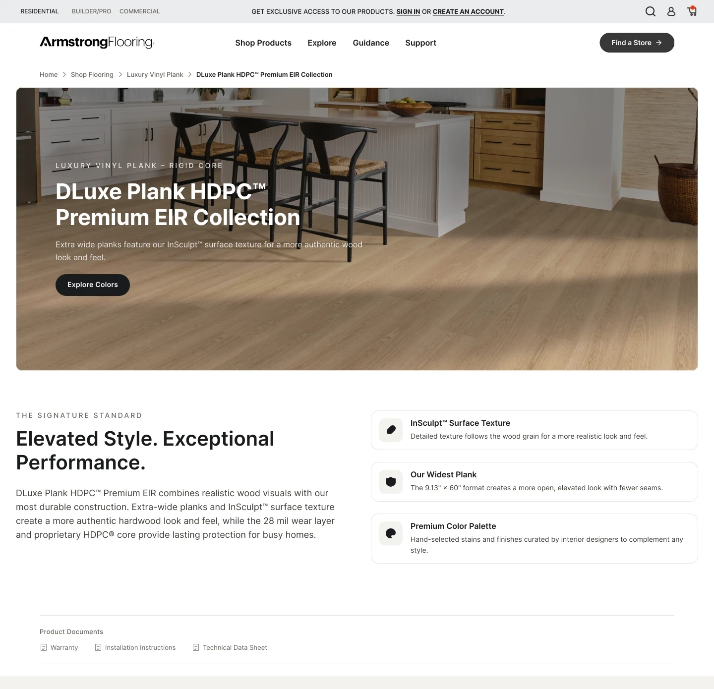
Each collection page explains construction, durability, comfort, and features before presenting available colors. Homepage and navigation links can now lead to that explanation instead of directly to individual color listings.
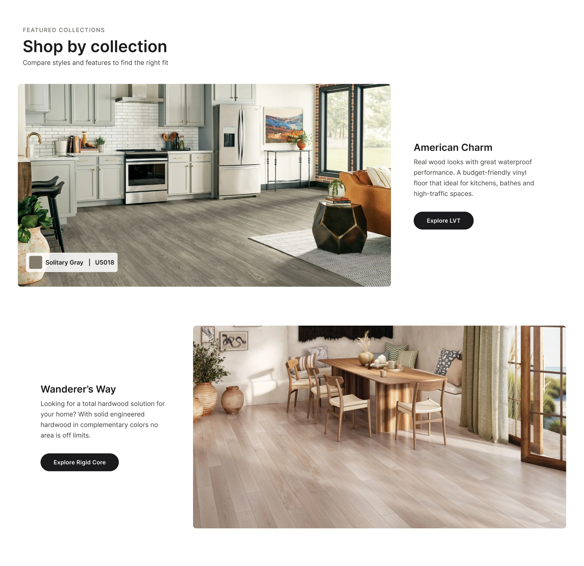
Link the room image to the floor shown.
I added a product label alongside the collection button. Visitors can choose between the exact floor pictured and the broader range.
Direct product link: Select “Solitary Gray” to open product U5018.
Explore the details.
Keep your place.
Specifications open in a drawer rather than requiring a scroll down the page. Closing it returns shoppers to the same position with their selected floor unchanged.
The drawer accommodates different specification fields and amounts of content across products. Adding details does not require changing the main layout for imagery, colors, samples, and Where to Buy.
Reuse the collection template for the next launch.
For the next collection launch, the team can reuse the DLuxe template and replace the collection content and colors.
Resources and blog pages are the current delivery batch.
Images distinguish design captures from launched page types; the sitemap records the planning work.