Armstrong Residential
Creating the missing step between browsing and choosing.
The site moved shoppers toward individual products before explaining the collections behind them. I redesigned the category and collection experience so visitors could understand the differences first, then explore the right products. The work connected information architecture, hands-on interface design, and delivery.
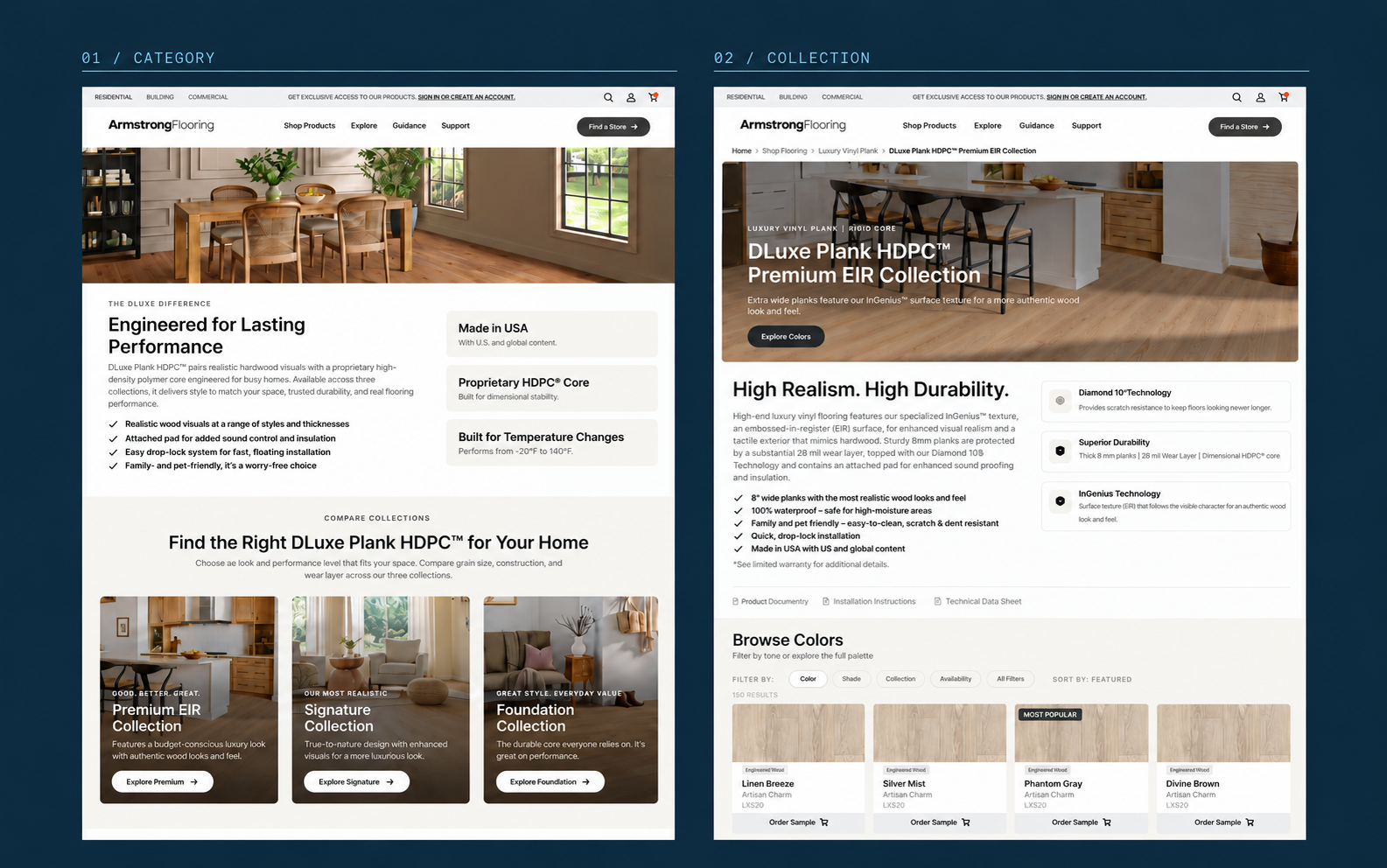
A product grid could not explain the whole range.
Individual colors appeared before shoppers had enough context to understand the collections. I gave category, collection, and product pages distinct roles, turning a list of products into a sequence of decisions.
- 01
Category
Which collection fits my needs?
- 02
Collection
What makes this range right for me?
- 03
Product
Is this the floor I want?
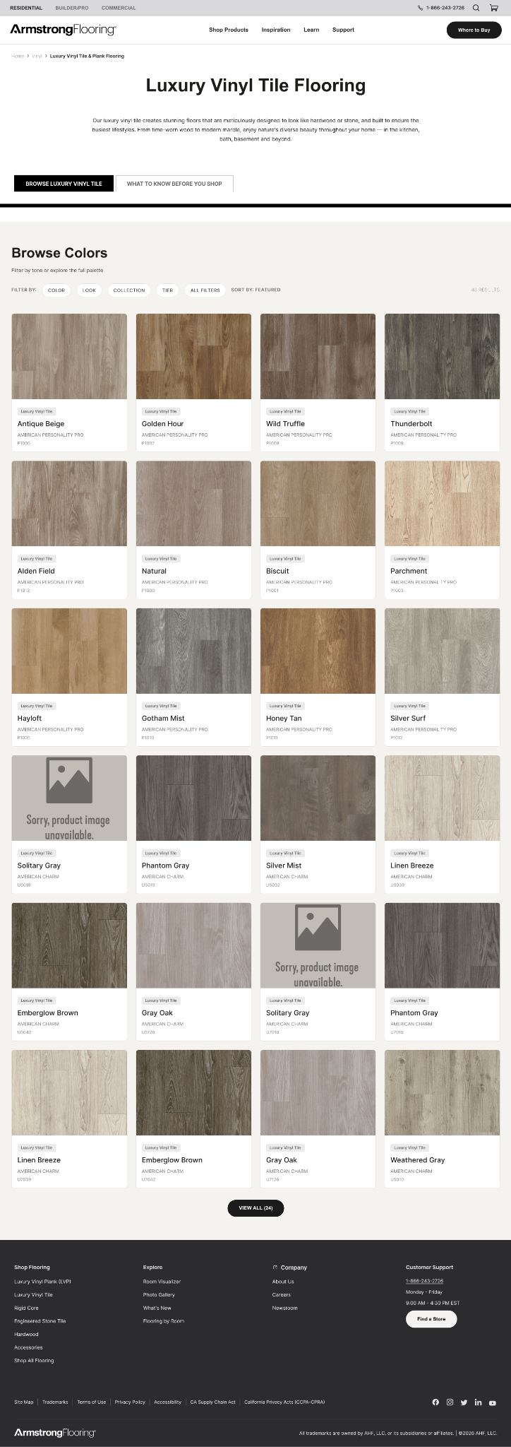

Navigation that reflects the way the range is organized.
Mapped the site and designed desktop and mobile navigation around the new hierarchy. Category and collection destinations made the structure visible in the interface; the working sitemap also accounted for resources beyond the first release.
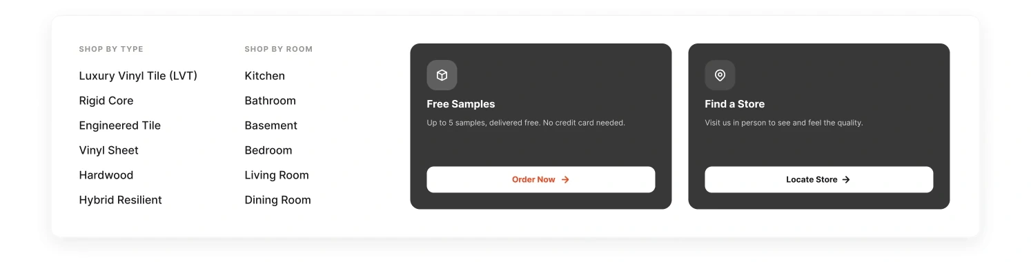
See the information architecture
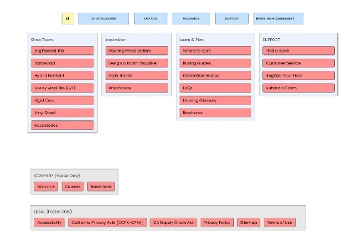
Make the differences visible in one place.
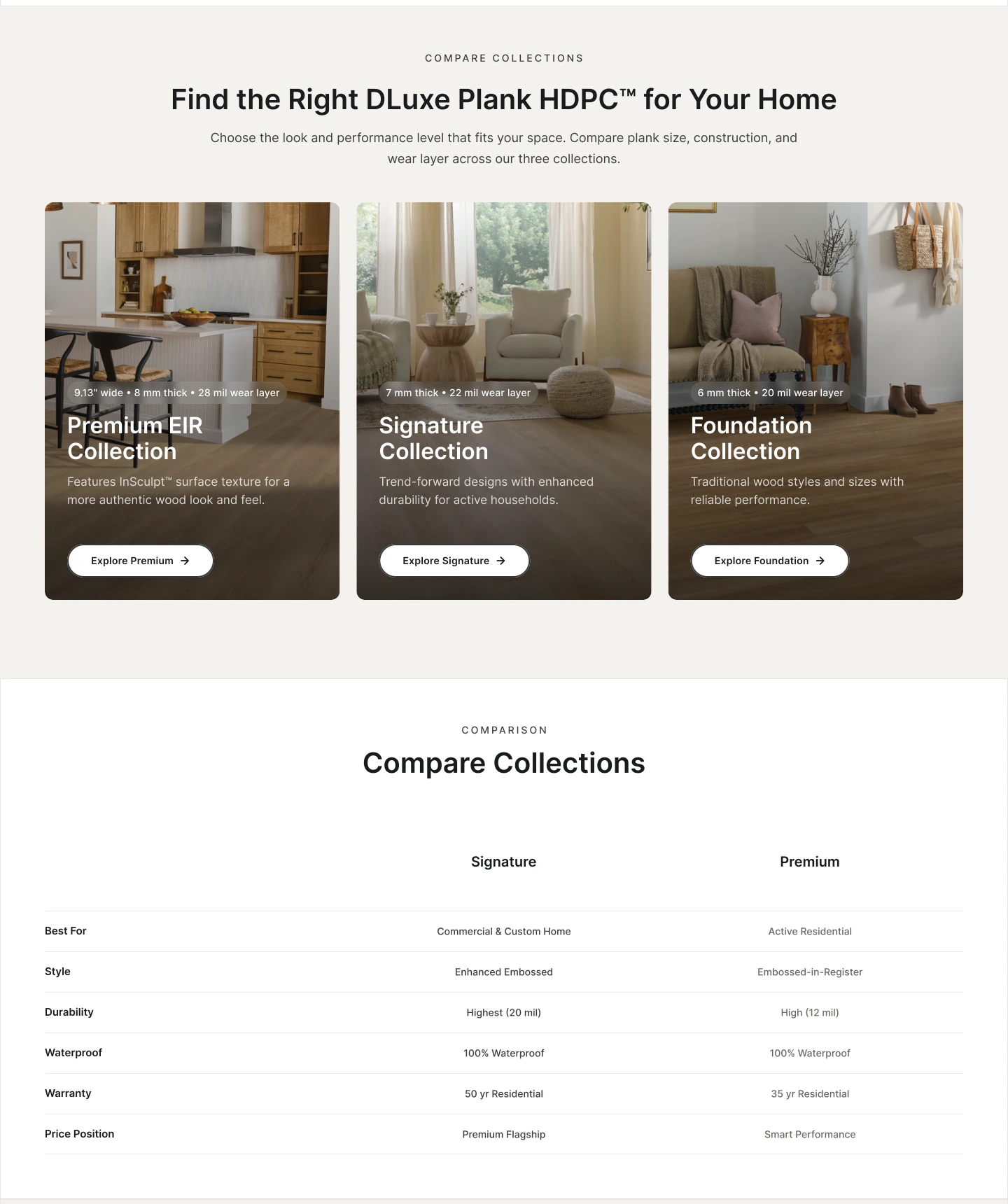
Designed a side-by-side comparison of the three DLuxe collections, working with product partners to align positioning and specifications. Using the same attributes across all three gave shoppers a direct way to compare the range.
DESIGN IN DETAIL
Three decisions behind the experience.
Context before colors
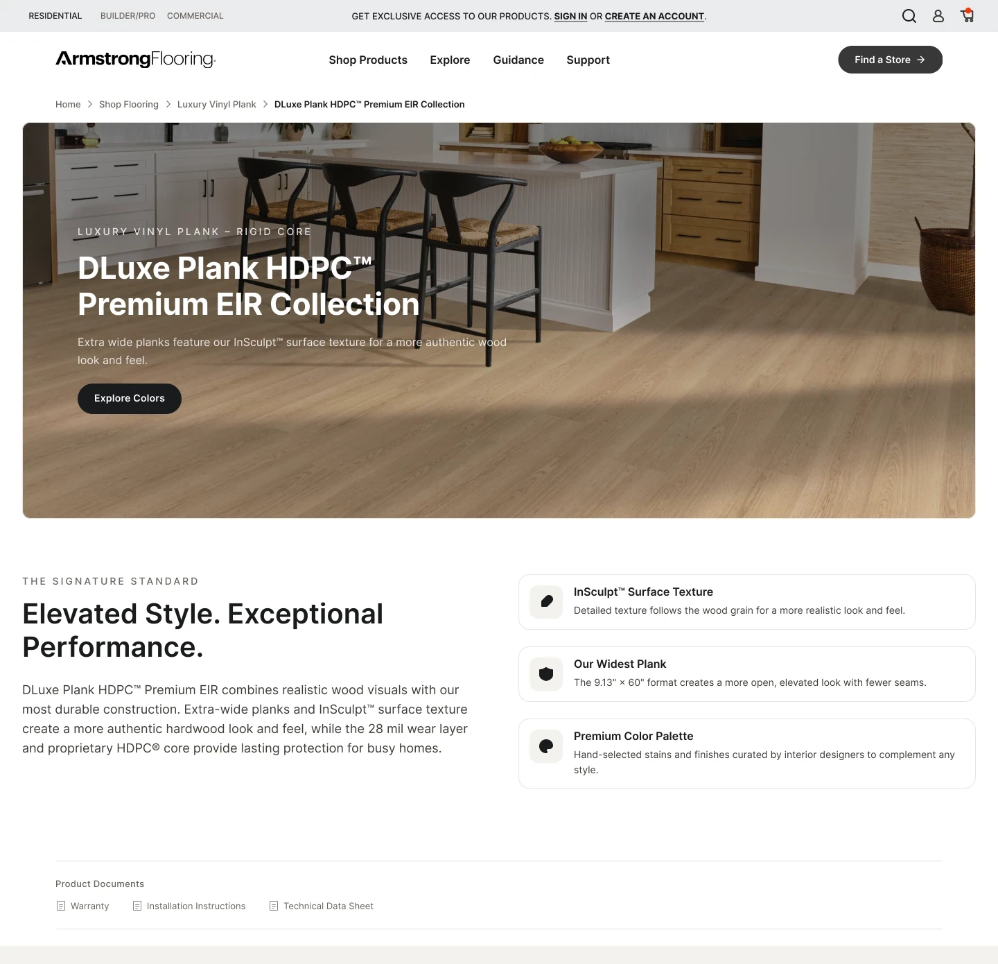
Collection benefits come before the product grid, so visitors can understand the range before choosing a color.
Comparable information
The same attributes appear across the three DLuxe collections, making differences visible without moving between pages.
A distinct role for each page
Category pages support comparison; collection pages explain the range; product pages hold the detail needed to choose.
Give each collection a place to explain itself.
Created dedicated collection pages where none existed. Collection benefits and construction details precede the available colors, giving visitors context before asking them to choose a product. A reusable layout carries that structure across the range.
Carry the design through to the product page.
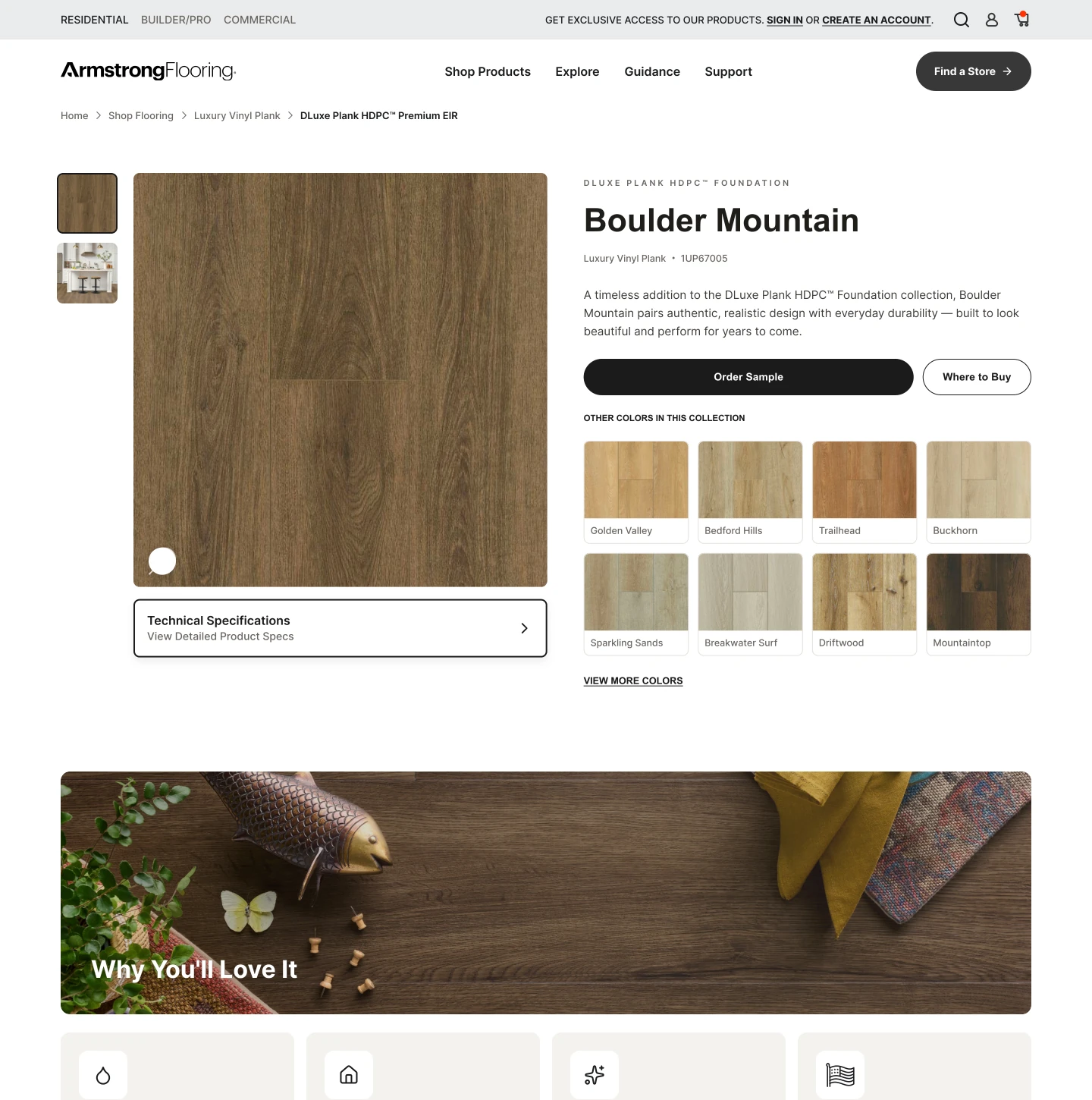
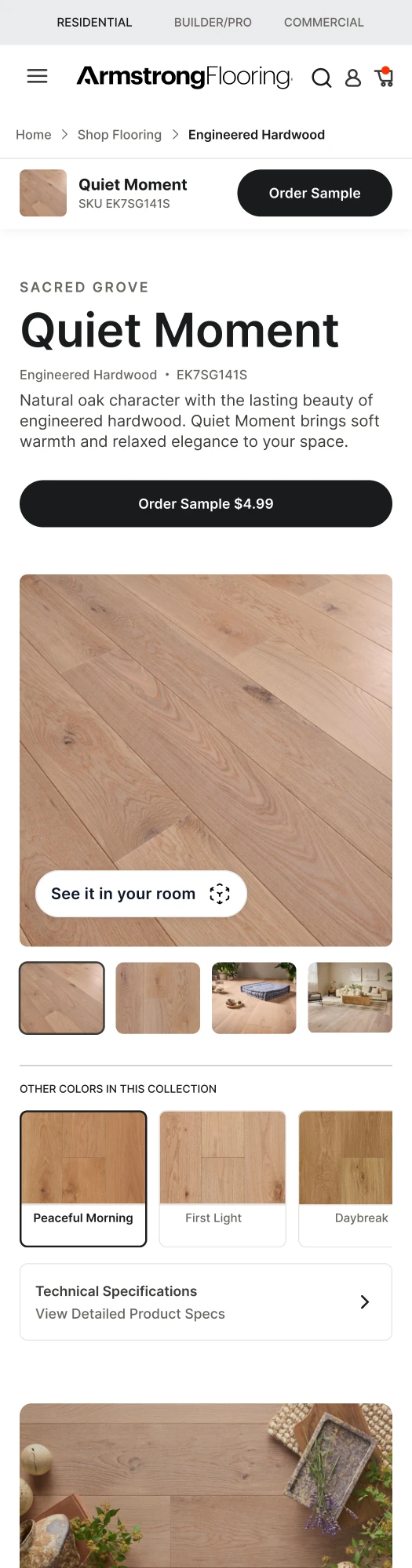
Redesigned desktop and mobile product pages with stronger imagery, clearer sample actions, and more accessible specifications. The updated PDP is live, with the experience rolling out to additional categories in batches.
Resolve what the design depends on.
Aligned collection names, positioning, and specifications with product and data partners, then clarified development requirements and reviewed the built pages. PDP reviews exposed missing texture, edge, and wear-layer fields, which I raised with the relevant partners as part of the rollout.
Collection context before product choice
Category and collection pages explain the range before visitors reach individual colors.
A live, connected experience
Redesigned category, collection, and product pages connect browsing with the details needed to choose.
A repeatable foundation
Shared page layouts support a phased rollout to additional categories.